Colour coordination stands as one of the most powerful tools in transforming any living space from ordinary to extraordinary. The careful selection and pairing of colours can dramatically alter the perception of room size, mood, and overall aesthetic appeal. For Kiwi homeowners looking to refresh their interiors, understanding the principles of colour coordination opens up endless possibilities for creating spaces that truly reflect personal style while maintaining visual harmony.
The psychological impact of colour cannot be overstated. Different hues evoke distinct emotional responses and can influence how we feel in our homes. Warm colours like terracotta, golden yellows, and rich oranges create inviting, energetic atmospheres perfect for social areas like living rooms and dining spaces. Cool tones such as sage greens, soft blues, and lavender promote relaxation and tranquillity, making them ideal choices for bedrooms and bathrooms. Understanding these fundamental relationships allows homeowners to intentionally craft spaces that support their desired lifestyle and daily routines.
New Zealand’s unique natural environment provides exceptional inspiration for colour palettes. The country’s diverse landscapes, from golden beaches to lush native forests and dramatic mountain ranges, offer a wealth of organic colour combinations that work beautifully in residential settings. Drawing from these natural elements creates interiors that feel authentic and connected to their surroundings.
The colour wheel serves as the foundation for all successful colour coordination schemes. Primary colours – red, blue, and yellow – combine to create secondary colours: green, orange, and purple. Tertiary colours emerge from mixing primary and secondary hues, resulting in sophisticated shades like blue-green, red-orange, and yellow-green. This systematic approach to colour relationships provides the framework for creating balanced, pleasing combinations.
Complementary colours sit directly opposite each other on the colour wheel and create high contrast, vibrant combinations. Think of classic pairings like navy blue and burnt orange, or deep purple and golden yellow. These combinations work particularly well as accent schemes, where one colour dominates while the other provides striking highlights through accessories, artwork, or feature walls.
Analogous colour schemes utilise colours that sit adjacent to each other on the wheel, creating harmonious, soothing combinations. For example, pairing soft blues with blue-greens and greens creates a serene, cohesive palette reminiscent of coastal environments. These schemes work exceptionally well in New Zealand homes, where the natural landscape often features similar analogous relationships.
The 60-30-10 rule provides a foolproof formula for distributing colour throughout any space. Sixty percent of the room should feature your dominant neutral colour, typically appearing on walls and large furniture pieces. Thirty percent comprises your secondary colour, often found in upholstery, curtains, or significant decorative elements. The final ten percent consists of accent colours that add personality and visual interest through smaller accessories, artwork, and decorative objects.
Neutral colours form the backbone of successful colour coordination. However, neutrals extend far beyond basic beige and white. Consider warm neutrals like mushroom grey, soft taupe, or cream that complement New Zealand’s natural timber features. Cool neutrals such as dove grey, soft white, or pale stone work beautifully with contemporary architectural styles. These neutral foundations provide flexibility, allowing you to experiment with bolder accent colours without overwhelming the space.
Texture plays a crucial role in colour coordination, adding depth and visual interest even within monochromatic schemes. Different materials reflect and absorb light differently, causing the same colour to appear varied across surfaces. A sage green wall paint will look distinctly different from sage green velvet cushions or a sage green ceramic vase. Incorporating various textures prevents colour schemes from appearing flat or monotonous.
Living areas benefit from warm, welcoming colour schemes that encourage social interaction and relaxation. Consider earthy palettes inspired by New Zealand’s natural landscapes: warm terracotta paired with cream and forest green, or soft ochre combined with sage and charcoal. These combinations create sophisticated, timeless looks that work well with both modern and traditional furnishings.
Kitchen colour coordination requires careful consideration of existing fixtures and appliances. White or light-coloured cabinetry provides a neutral base that works with virtually any accent colour. However, don’t overlook the impact of your benchtop, backsplash, and flooring materials when selecting your palette. Natural stone and timber elements often dictate complementary colour choices, creating cohesive schemes that feel intentional rather than accidental.
Bedroom colour coordination should prioritise restful, calming combinations. Soft blues paired with cream and gentle grey create serene environments conducive to quality sleep. Alternatively, warm neutrals like blush pink, soft beige, and ivory can create cosy, nurturing atmospheres. According to Building standards, adequate natural light in bedrooms is essential, so consider how your chosen colours will appear in both natural and artificial lighting conditions.

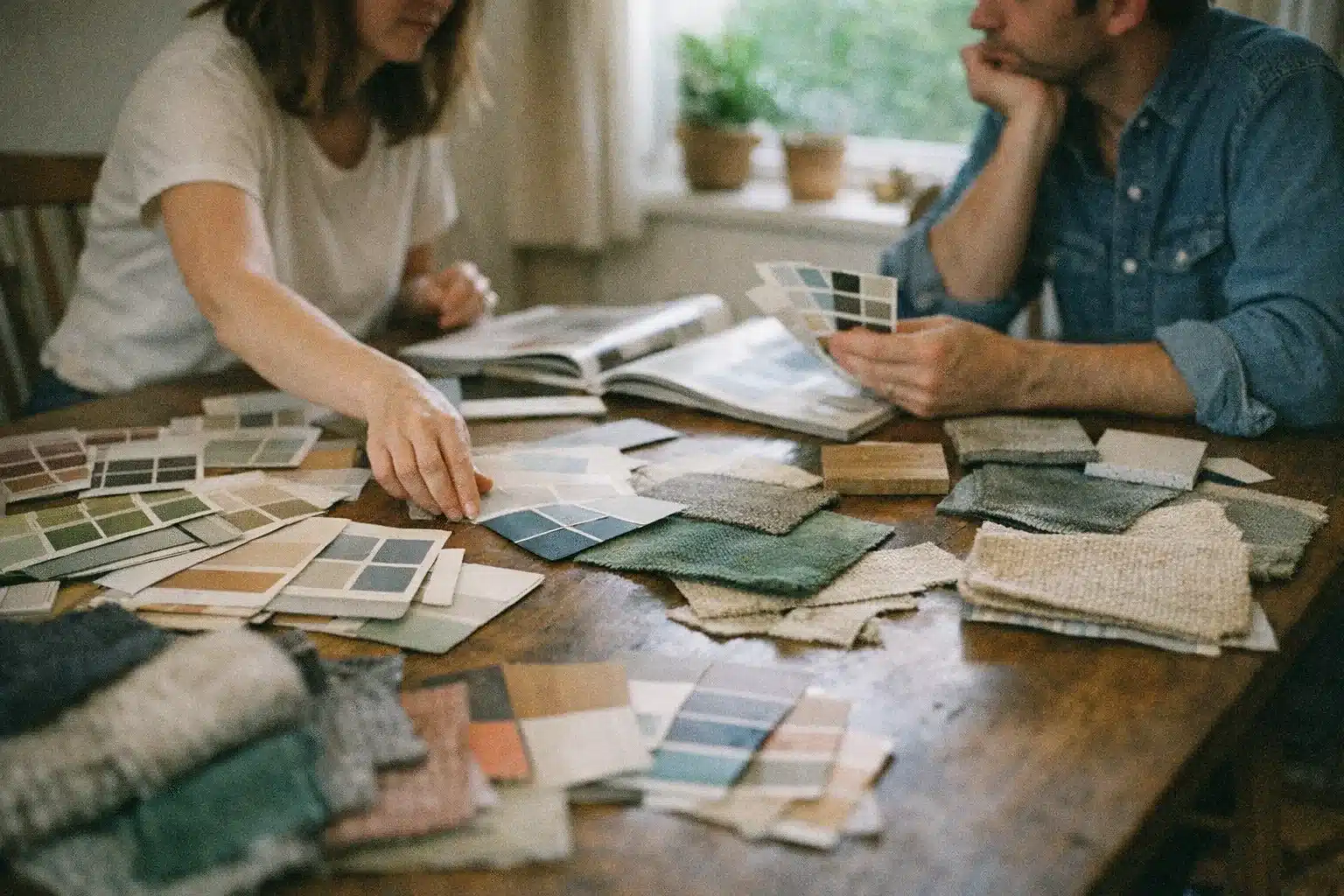
Before committing to any colour scheme, test your chosen palette using sample pots and fabric swatches. Paint large squares on different walls to observe how colours change throughout the day as natural light shifts. This process reveals how morning sunlight, afternoon brightness, and evening artificial lighting affect your chosen hues. What appears perfect in the paint shop may look entirely different in your specific room conditions.
Start with one room and expand your colour coordination gradually throughout the home. This approach allows you to refine your palette and gain confidence before tackling larger projects. Choose a favourite piece – perhaps artwork, a rug, or an existing furniture item – and build your colour scheme around its existing hues. This ensures at least one element will coordinate perfectly with your new palette.
Consider the flow between rooms when developing colour schemes. While each space doesn’t need identical colours, maintaining some consistent elements creates visual continuity throughout the home. This might involve repeating one accent colour in different intensities, using similar neutral tones, or incorporating related colour families that complement each other.
Seasonal colour adjustments provide opportunities to refresh spaces without major renovations. Summer palettes might emphasise cooler blues and greens, while winter schemes could incorporate warmer oranges and deep reds through easily changeable elements like cushions, throws, and artwork. This approach keeps interiors feeling fresh and responsive to changing seasons and personal preferences.
Many homeowners make the mistake of matching colours too precisely, creating spaces that feel rigid and uninspiring. Instead of exact matches, seek colours that harmonise while providing subtle variation. Different shades and tints of the same colour family create more interesting, dynamic schemes than perfect matches throughout the space.
Ignoring undertones represents another frequent coordination error. Every colour contains subtle undertones that may not be immediately apparent but significantly impact how colours work together. Cool-toned greys clash with warm-toned beiges, even though both appear neutral. Understanding and identifying these undertones prevents costly colour coordination mistakes.
Failing to consider lighting conditions leads to disappointing results. Colours appear dramatically different under various lighting types – natural daylight, warm incandescent bulbs, and cool LED lights all affect colour appearance. Always evaluate colour choices under the actual lighting conditions where they’ll be used.
Mastering colour coordination transforms houses into homes that reflect personal style while creating harmonious, visually pleasing environments. By understanding colour theory principles, considering room-specific requirements, and implementing practical testing strategies, Kiwi homeowners can confidently create beautiful interiors that stand the test of time. Remember that successful colour coordination is ultimately about creating spaces where you feel comfortable, inspired, and truly at home.
This article is proudly brought to you by the New Zealand Knowledge Collective. We bring together expert insights and practical wisdom for informed living in today’s world. Through our network of Kiwi specialists and evidence-based resources, we’re dedicated to enhancing your knowledge journey across Aotearoa and beyond. Explore our latest posts and stay informed with the best in Books, Travel, Online Education, Personal Finance & Investment, Technology, and Home & Interior Design!
Tania R. says:
We did exactly that in our shop last year, swapped out all the beige for a proper teal and cream combo, and customers genuinely spend longer in there now. Colours that actually chat to each other rather than just sit there make all the difference to how a space feels.
jess.lee says:
Nah, we reckon the same here. Going monochrome on one wall feels a bit safe. When we painted our lounge with two complementary colours, the whole room started feeling alive. They bounce off each other and make the space feel bigger somehow. The trick is picking colours that are genuinely in conversation, not just random. Makes such a difference to how a room actually functions day to day.
the_fix_it says:
Nah reckon the opposite works better, throw colour on multiple walls and let them talk to each other instead of banking everything on one focal point.
marcus_b says:
I reckon the trick is picking one wall that naturally draws attention, like where your couch faces, because if you go random with it the whole space just feels scattered.
Sophie M. says:
Yeah, the accent wall thing actually works because it gives your eye somewhere to land. I’m curious though, did you find there’s a sweet spot where you can add colour without it feeling like it’s fighting the rest of the room.
Poppy M. says:
Been repainting my lounge and learnt the hard way that going too matchy-matchy with neutrals just makes everything feel flat and dull. Threw in a deeper accent wall and suddenly the whole room came alive.